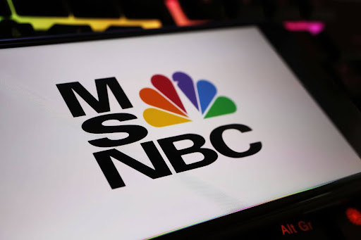
When MSNBC announced its rebrand to MS NOW last week, the move sparked strong responses (and some instant mockery) across social media. Yet beyond the reactionary hot takes and memes lies a strategic pivot worth examining: it’s not just for what it signals about MSNBC’s future, but what it risks abandoning from its past.
The network, historically positioned as a progressive mainstay, has opted for a bold new identity: stark red, white, and blue visuals replacing the iconic rainbow peacock. The new name, MS NOW, comes with a stripped-down promise: My Source. News. Opinion. World. It’s sharp, punchy, and to many, oddly generic. The design cues and palette, whether intentionally or not, lean toward centrist or even conservative visual language. This isn’t just cosmetic. It’s communicative.
Visual Language Is Never Neutral
What makes this pivot particularly noteworthy is its divergence from the network’s roots. MSNBC built a reputation on progressive commentary and left-leaning analysis. Its audience showed up for that perspective. To shift the visual identity so dramatically without clear narrative framing risks alienating loyal viewers while attempting to lure a new demo that may never convert.

A Familiar Branding Mistake
This moment draws a clear parallel to the “HBO Max” to “Max” rebrand, where the removal of “HBO” attempted to widen appeal but inadvertently diluted a premium, high-trust identity. That change, much like this one, seemed to downplay the very thing that made the brand resonate. It’s a cautionary tale: equity isn’t just built on what you say, it lives in what people recognize, remember, and trust. HBO made its return to “HBO Max” after only two years of “Max.” We may see the same flip-flop here.

To be clear, brands must evolve, but evolution without strategic clarity often invites confusion, or worse, ridicule. That’s precisely what this rebrand has sparked online: a flurry of jokes, jabs, and head-scratching responses. It’s not surprising. Removing “NBC” while retaining “MS,” decades after the Microsoft partnership ended, creates inconsistency. And the acronym “MS NOW” carries unintended connotations that only compound the disconnect.
Visual Equity Is Brand Equity
There’s a larger lesson here for brand leaders: visual continuity is not optional. It’s the thread that weaves together past, present, and future. When that thread is abruptly cut, even with good intent, you risk becoming unfamiliar. In the pursuit of broader appeal, MS NOW may have opened the door to broader confusion.
Final Thoughts: Change Without Clarity Carries Consequences
It remains to be seen whether this rebrand will gain traction or follow the path of other corporate identity shifts that were eventually walked back, like with HBO. What’s clear is that meaningful brand strategy can’t rely on aesthetic overhaul alone. It must be rooted in story, in substance, and in a clear understanding of the audience you have and the one you’re trying to reach.
Are you looking to revive your branding with intent? Talk to our experts.
Reputation Wins Business
Strategic communications that position your brand to lead—through trust, clarity, and influence.